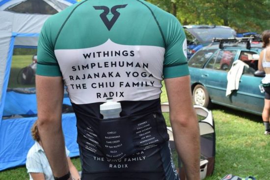
As cyclists we don’t have a ton of options when it comes fashion cuts and fabrics. Kits become an expression of our own style identity through patterns, colors, shapes, and sponsor logos. Like fashion designers, some teams and companies have become celebrated for their ultra sleek and well designed kits. But, what makes these kits stand out amongst the rest? What makes a great kit? At PDF, we are exploring this topic with a new series of interviews with designers, cyclists, artists, and team owners to get their opinions on the topic.
Who better to start it off than legend and long time cycling tastemaker Richard Sachs.
Who designed your kit?
The kits have been designed by House Industries for the past three seasons. They also select the colors used for the paint schemes.
In your collaboration with House Industries, how much of their style influenced the kit?
I know that their Neutraface is the only font/typeface that appears on my kits. Part of the project was convincing all my other sponsors to forego their respective logos and wordmarks and trust that a cohesive look of just (their names in) Neutraface would be an asset rather than a liability. In short, we wanted to lose the NASCAR slash yard-sale look that appears on so many kits.
According to your opinion, what makes for good kit design?
If the colors, the readability, the fit, and all aspects of the kits (including the way all garments work in harmony with each other, as well as with the bicycle and any related graphics on the components) – if all of this turns a head and makes one pause, it’s a good start to being good design.
Traditionally, your brand has always been red. Why the switch to saffron in 2013 and now green?
I gave up on the red thing years ago, feeling I took it as far as I could. I’m long from being done and I didn’t want to reach that fateful last day with second thoughts about what could have been. To that end, I approached House Industries in 2011 and asked if they’d want to take what I had and transform it. There was no plan, or limits, or timeframe. They might have/could have changed only a hue, or one letterform, or the scale of my logo – I was of the mind of, “Here. You do it. When it’s complete I will roll with and love it.” That’s how confident in them I was, and also how blindly I went into the re-skin project. I couldn’t be happier.
Your team is strictly for cyclocross. When coming up with the kit design, were any decisions made based on the kit being a skinsuit vs. jersey and bibs?
For our cyclocross kits, we consider the skinsuit to be the default garment. Therefore, some of the graphic applications are switched on these (versus the jerseys and outerwear) so that the sponsors are on the front panel. On all other items, my name and RS logo live there. Since more eyeballs and lenses see the riders coming rather than going, we’d rather have the list front and center as they approach. After the event, on the podium, in the parking lot, and when training during the week, the other clothes have a less commercial bent.
Photography Courtesy of Carlos Alejandro and House Industries


