Okay, first a little background.
We spend about a week sweating the Richard Sachs downtube logo. Shaved some Cs, redrew some Ss and flattopped some As. In the end, we found ourselves yawning a bit and gravitating back toward straight up Neutraface like we used in the dropouts. We figured that any change we made there would not give us the impact that we all want. I think what we’ll end up with is a hybrid with some shaved Cs and Ss to close up negative space, but not stray to far from the original mark. It also ties in with your original RS lockup.
We also started futzing with the tubing decals and other little bits to pull everything together typographically.
.
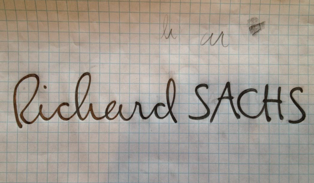
The Signature:Then we started to look at the signature. We figured this was something we could refine a bit while still maintaining its visual equity, but then give it some utility as a trademark. Something you could run across a racing kit, down a leg, on a T-shirt or on a downtube. Or as a nice top tube detail as it is now.
Ken did a few sketches and tightened it up a bit. After you sent that second round of sigs today we started to look how you unicase your last name and sometimes have an upstroke in the S to connect with the A. We may pick that up in a later edition. However, before we really start sweating the letterforms, weight and application, we wanted to take your temperature about this direction. Then we’re going to riff off of this for the rest of the layout. Ultimately, it will be vectored to make life easier when ordering decals, clothes, etc, but we’ll refine more with pencil for a while.
The above a note from Rich Roat (RIP) to me in 2012 regarding the House Industries reskin of my brand.
.