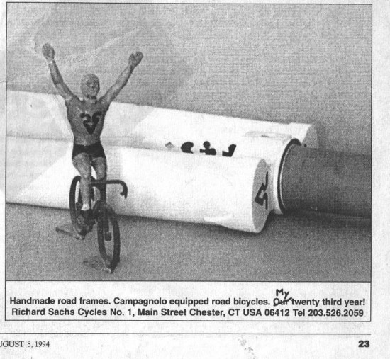
I used to advertise a lot. A lot. I had contract insertion orders in most of the mainstream cycling periodicals in the pre-internet era. That was then atmo. One of my self-imposed standards going back to that first ad in 1975 was to only present information, and to resist using (as in never) superlatives, adjectives, comparisons, or dangling participles. That last one is levity, so disregard it. Anyway, I ran the gamut of studio shots with text added to the mechanical art, and began working the irreverence angle. Here’s one example from 1994. I had this European figurine that I hand drew a logo on and it lived on my windowsill. For a while, he’d somehow appear on my bench next to whatever I was working on. Grab camera, insert film, take shot. Who needs Mad Men anyway?! This particular number had the word “Our” deliberately struck though with a “My” seemingly handwritten in the art file as a way of poking fun at how others used the corporate “we” and “our” when in fact they were only one-man entities. Heck – I thought it was funny. By the way, these advertisements were from the pages of Velo-News.
.

